7 Essential Tips for Choosing the Perfect Website Typography
October 17, 2024
When it comes to web design, typography is more than just an aesthetic choice; it is a crucial element that can significantly impact the user experience, readability, and ultimately, the success of your website. Here are seven essential tips to help you choose the perfect typography for your website.

Table of Contents
1. Choose a Font that Communicates Your Brand Values
The font you select for your website is not just about aesthetics; it also conveys the personality and values of your brand. Different typefaces evoke different emotions and associations. For instance, a handwritten font might suggest a personal or creative approach, while a sans serif font could indicate a modern and professional vibe.
To ensure your font choice aligns with your brand, consider the mission and purpose of your website. Ask yourself what message you want to convey and how the font can help achieve that. Consistency is key; using a consistent brand font across all your web pages builds trust and reinforces your brand identity.
2. Pair Fonts That Complement Each Other
While it’s advisable to limit the number of fonts used on your website, sometimes combining two different typefaces can enhance the visual hierarchy and readability. When pairing fonts, look for similarities or contrasts. You can combine fonts from the same family, such as Source Sans and Source Serif, or use different categories like serif and sans serif fonts.
The key is to ensure that the fonts you choose do not create complexity but rather complement each other. For example, using a serif font for headings and a sans serif font for body text can create a harmonious and readable layout.

3. Use Visual Hierarchy and Headings
A well-structured visual hierarchy is essential for guiding users through your content. Use headings, subheadings, and different font sizes to create a clear hierarchy. Assign specific roles to each level of type, such as body text, headers, subheaders, and quotes. This helps users quickly scan and understand the content on your page.
Ensure that your typographic scale is connected to CSS custom properties to maintain consistency across different devices and screen sizes. This approach makes your content easier to read and digest, both for humans and search engines.
4. Limit Line Length
The length of your lines can significantly affect readability. Long lines are as difficult to read as short ones. The ideal line length is between 60 characters for desktop and 30-40 characters for mobile devices. This range helps prevent eye fatigue and keeps users engaged.
To achieve optimal line length, restrict the width of your text blocks using em or pixels. This ensures that your text is readable across various screen sizes and resolutions.
5. Use Enough White Space Between Lines
White space, or leading, is the vertical space between lines of text. Properly adjusting the leading can improve readability. A good starting point is to set the leading to about 1.5 times the font size. However, this can vary depending on the font type and size. For example, smaller or lighter fonts may require more space, while oversized fonts might need less.
Increasing the leading between different type hierarchies, such as between headers and body copy, also enhances readability. Remember, the goal is to provide enough space to make the text comfortable to read without causing confusion or eye strain.
6. Ensure Readability and Accessibility
Readability and accessibility are paramount when choosing a typeface. Select fonts that are readable without assistance, especially for users with disabilities. Use a base font that is at least 16 pixels or larger, depending on the typeface. Choose typefaces with a large, consistent x-height to improve legibility.
Avoid using images of text, as they can be grainy, cannot be read by search engines, and do not scale well on different devices. Always check your type styles against the Web Content Accessibility Guidelines (WCAG 2.1) to ensure your website is accessible to all users.
For more ways to enhance your website’s performance, you might want to explore AI-driven optimization services.
7. Break Up Text and Use Contrast
Breaking up text into manageable chunks is crucial for maintaining user engagement. Use paragraphs, lists, block quotes, and varying elements to facilitate easy scanning of your web page. This approach helps users quickly find the information they are looking for and increases the likelihood of them staying on your page.
Contrast is also vital for readability. Ensure that your text stands out from the background and other design elements. Use different colors, sizes, and weights to create contrast between different text elements. For instance, using a different color or size for headings can make them more distinguishable from body text.
For a deeper insight into how AI can improve content creation, read our guide on how to generate marketing content with AI effectively.

Conclusion and Next Steps
Choosing the perfect typography for your website is a multifaceted task that requires careful consideration of several factors. By following these seven essential tips, you can significantly improve the readability, accessibility, and overall user experience of your website.
However, optimizing your website’s typography is just one aspect of creating a highly effective online presence. To take your website to the next level, consider leveraging AI-driven optimization services. Our agency specializes in using AI to enhance website performance, improve user engagement, and drive conversions.
Explore our insights on AI-driven strategies for 2024 to stay ahead of the curve.
Ready to transform your website? Explore our AI optimization services today and discover how we can help you achieve your digital marketing goals.
Click here to learn more about our AI-driven optimization services.
By optimizing your typography and leveraging advanced AI tools, you can create a website that not only looks great but also performs exceptionally well. Don’t miss out on the opportunity to enhance your online presence and drive more traffic and conversions.
Contact us now to schedule a consultation and see how our AI optimization services can benefit your business.
Get in touch with our experts today.
Remember, good typography is just the beginning. With the right tools and expertise, you can create a website that truly stands out in the digital landscape.
FAQ
How does typography affect the user experience of a website?
Typography significantly impacts user experience by influencing readability, brand perception, and visual hierarchy. Well-chosen fonts and proper spacing can enhance content comprehension, guide users through information, and reinforce your brand’s personality. Poor typography choices can lead to eye strain, confusion, and a negative impression of your website.
What is the difference between serif and sans-serif fonts in web typography?
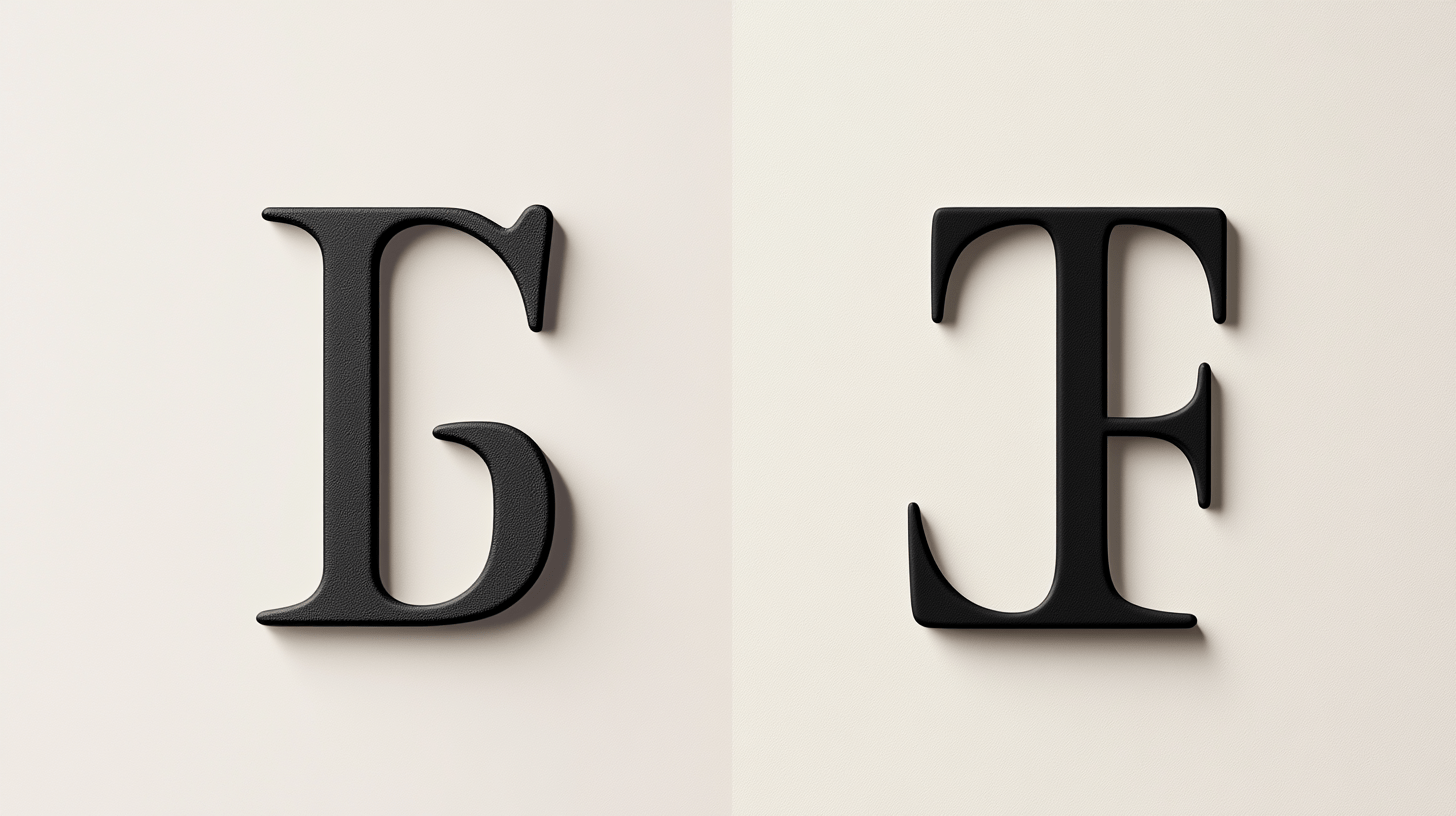
Serif fonts have small decorative lines at the ends of letter strokes, while sans-serif fonts don’t. Sans-serif fonts are often considered more modern and clean, making them popular for digital displays. Serif fonts can add a traditional or formal touch and are sometimes used for headings to create contrast.
How can I ensure my website’s typography is accessible?
To make your typography accessible, use sufficient color contrast between text and background, avoid using text in images, ensure text can be resized without breaking the layout, and choose easily readable fonts. Also, maintain proper line spacing and text alignment. Regular testing with accessibility tools can help ensure compliance with WCAG guidelines.

